Tuesday, 14 December 2010
Evaluation.
Computers in Art and Design has been the most exciting and most interesting brief of the year so far. I have thoroughly enjoyed learning about the digital technology in fashion and now have some knowledge of what it is all about. I feel that this brief has boosted my confidence to experiment with a wide range or medias, traditional and digital. Photoshop was completely new to me and I now feel confident in cleaning up images, and editing them to create different effects.
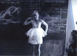
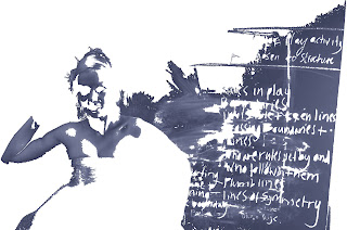
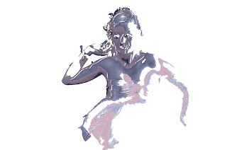
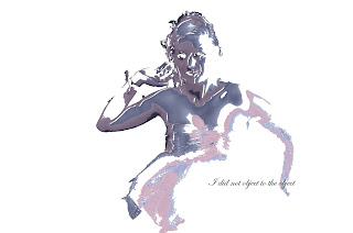
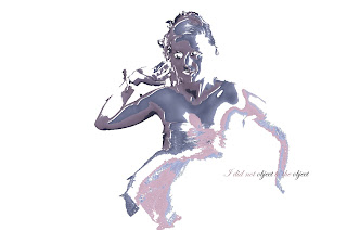
Another image taken from the CSM styling course I attended. Using the 'magic wand' tool in photoshop I selected an area of the first image creating the second image just to experiment. I then decided to use this method and I repeated what I did, this time using a smaller section of the image. I then created a new layer and selected another area and pasted it over the top, using the paint filler and decreasing the opacity i then added to colour into my new section. I then repeated this a couple of times and simply placed the images on top of one another. Finally i added some font in and changed the effects on some of the words.
I am very pleased with the outcome of this and this illustration I feel, is the best out of all the ones I have produced in this brief, I also feel that this is the one that I experimented with the most and is the most interesting.
Johnny Cheuk
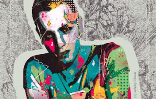
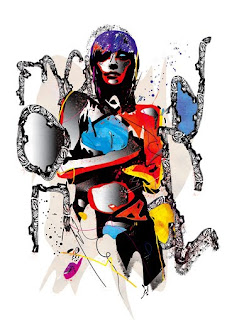
In comparison to Sarah Hankinson, Johnny Cheuk uses much more digital media than he does traditional, his illustrations are very busy and full of colour. I feel the similarity between both illustrators is the mood that is portrayed in their work, their both very youthful and exciting. Johnny mixes his computer work with water based paint and pencils. I think that his illustrations are high street. His illustrations are very detailed and beautiful and I feel that his work is aimed at a very specific audience, young people that are interested in art and graphics.
I would like to experiment with different effects in my own illustrations to make more detailed and interesting work.
Sarah Hankinson
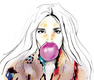
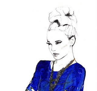
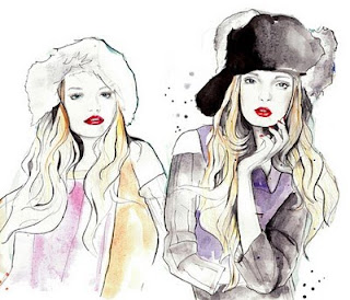
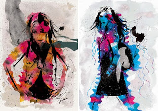
Sarah Hankinson is a Melbourne illustrator. Her work is a combination of traditional and digital media, and her work consists of broken line and bold splashes of colour. Sarah explains her signature as 'Youthful, feminine pencil drawings with a splash of colour.'
I think that she may produce the basic image using traditional media and then adds colour, effects and graphics using digital media.
I feel that the mood in most of her work portrays youth, and fun and I think that the market level is ready-to-wear.
I would like to use Sarah Hankinson's work as inspiration for my own illustrations, by incorporating the splashes of colour into my drawings.
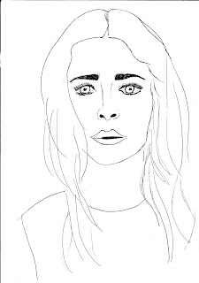
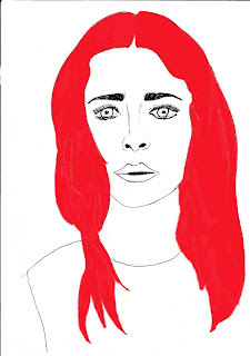
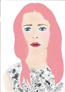
The first image is the image I started with, which is a simple drawing of a woman's face, I created this using pencil to begin with and then went over the lines using a fine liner pen. After scanning the drawing into photoshop I coloured the hair in using the paint brush tool. I then used the 'magic wand' to select the hair and added an effect which then made the hair colour go more of a pink and when looking closely it is created my tiny dots that reminded me of Roy Lichtenstein's work. My next stage was adding colour to the face using the airbrush tool and decreasing the opacity. I then also added colour into the eyes and the mouth. Finally for the t-shirt, I used the paintbrush tool but changed the shape to stars and overlapped then using black, by selecting the whole section I then added effects to make it look like this.
The Official Ralph Lauren 4D Experience - London
Designers are using fashion videos to advertise and promote their collections, videos are a good way of advertising as they can be seen on the Internet by all different audiences.
Monday, 13 December 2010
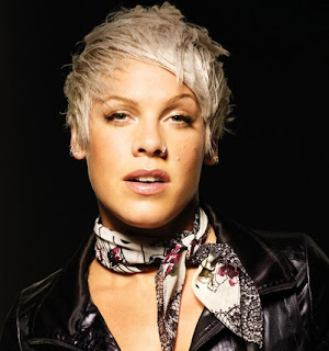
Drawing the image first using pencil, then going around the outline with a fine liner. I then scanned the image into photoshop and added colour into the scarf and using a blurring method softened the colours and made them less visible. When adding the colour into the eyes i changed the decreased the opacity so that the colour wasn't over powering.
my work
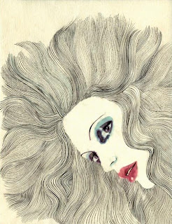
Image two- my own interpretation of the Margot mace illustration. For my first image i wanted to experiment with a line drawing so i traced the illustration and used a black fine liner for the features of the face and the hair, i then scanned my drawing in to photoshop and by using the paintbrush tool i added colour to the eyes and lips.
Fashion illustrations.
CAD/CAM
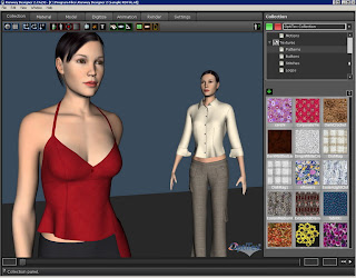
CAD (Computer aided design) is used in a variety of design fields, some of which include; architecture, graphics, engineering, and fashion. CAD makes the design process quicker allowing the designer to make changes to an idea; it also allows the design to be seen in three dimensions.
CAM (Computer aided manufacture) is the use of computer software to control machine tools and related machinery in the manufacturing of work pieces.
CAM (Computer aided manufacture) is the use of computer software to control machine tools and related machinery in the manufacturing of work pieces.
Digital Technology in Fashion
Communicating and visualizing a fashion creative direction or concept is a skill, which all designers should possess and develop to ensure strong representation of their ideas in a highly competitive world. Digital technology helps you to develop skills to create and deliver strong visuals, using applications such as Photoshop, and Illustrator.
Thursday, 9 September 2010
Central St.Martins, fashon stying course 2010.
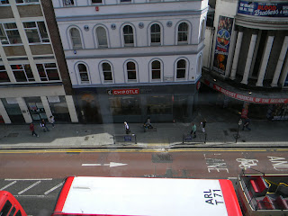
31/8/10 - 3/9/10
so this summer i did a 4day course 'fashion styling' at Central St.Martins College of Art and Design in London. The course involved: a styling project which was 'experimenting with draping and creating new and exciting shapes;' a lecture with a working stylist who was also one of the tutors; and finally a photo shoot.
i really enjoyed the course and i think this may be somthing i would like to do in the future.
wrap and drape
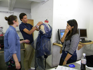
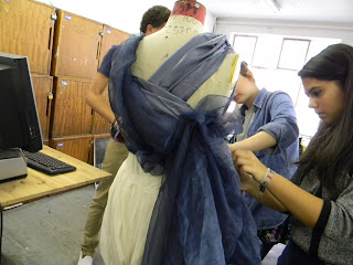
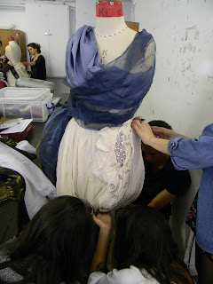
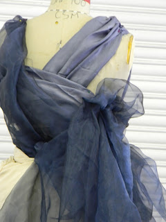
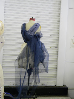
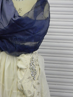
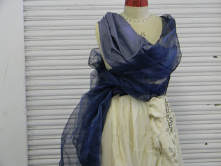
the idea here was to use classic colours, we used a cream skirt with lots of bright flowers on the bottom so we turned the bottom up out of the way, then we wrapped, draped, and pleated the silk and the same idea with the chiffon. when we thought we were finished he dress it was too standard so then we added an embelished jacket and pinned it to the side of the dress, this feature made the dress more interesting and gave a contrast in texture.
confusion and explosion
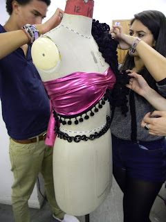
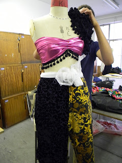
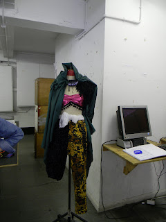
basically what we did for this one, was take all of the bright, weird, and random fabrics and clothing and put them all together on the mannequin, and as you can see we took up one of the trouser legs and wrapped a fabric that had a different pattern and contrast in colour around the leg. This one is my least favourite out of the three.
Subscribe to:
Comments (Atom)


